Python Matplotlib
Matplotlib
About Matplotlib
pip insall matplotlib
uv add matplotlib
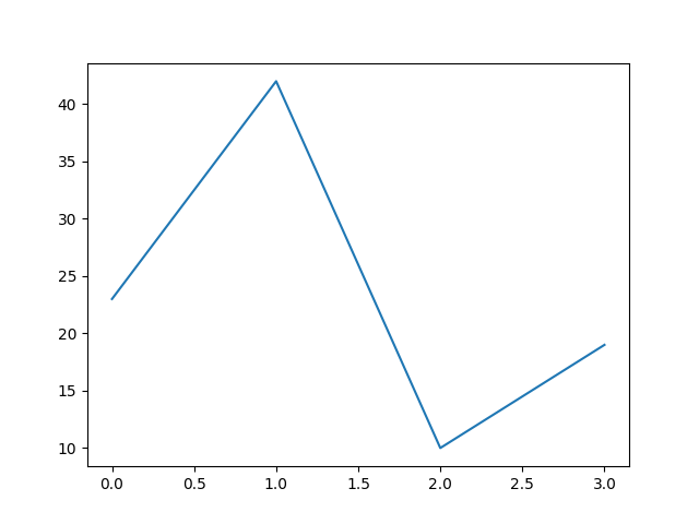
Matplotlib Line
import matplotlib.pyplot as plt

x = [ 3,  4,   5,  6 ]
y = [ 23, 42, 10, 19 ]
plt.plot(x, y)
plt.show()
#plt.savefig('line.png')
The numbers in the two lists are the values of the x and y axis respectively.
documentation of matplotlib.pyplot.plot

Line: y only
import matplotlib.pyplot as plt

y = [ 23, 42, 10, 19 ]
plt.plot(y)
plt.show()
#plt.savefig('plot-y.png')
The numbers in the lists are the values of the y axis.
The x axis defaults to the numbers 0, 1, 2, … as is needed.
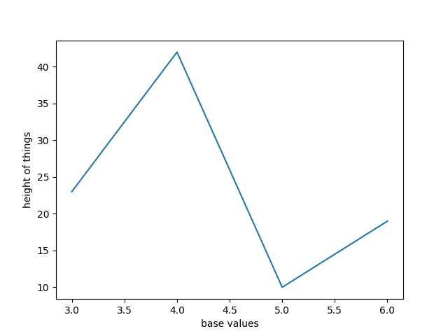
Line with labels (xlabel, ylabel)
import matplotlib.pyplot as plt

x = [ 3,  4,   5,  6 ]
y = [ 23, 42, 10, 19 ]

plt.plot(x, y)
plt.ylabel("height of things")
plt.xlabel("base values")

plt.show()
#plt.savefig('line_with_labels.png')
documentation of matplotlib.pyplot.plot
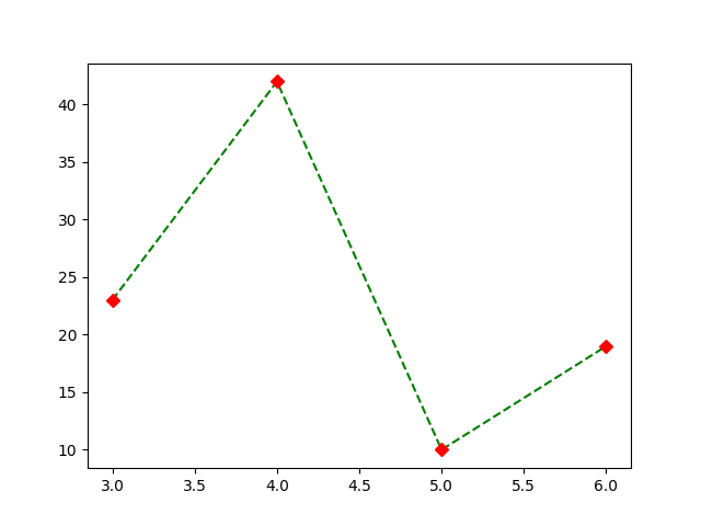
Line with formatting
import matplotlib.pyplot as plt

x = [ 3,  4,   5,  6 ]
y = [ 23, 42, 10, 19 ]

#plt.plot(x, y, "b-")  # blue solid line
#plt.plot(x, y, "ro")  # red circles
#plt.plot(x, y, "gx")   # green x-es
plt.plot(x, y, "g--")   # green dashed line
plt.plot(x, y, "rD")   # red diamonds

#plt.show()
plt.savefig('line_with_formatting.png')
See the documentation of plot for a listing of styles.
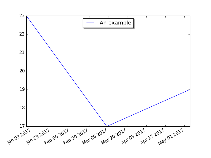
Matplotlib Line with dates
import datetime
import matplotlib.pyplot as plt

fig, subplots = plt.subplots()
subplots.plot(
    [datetime.date(2017, 1, 5), datetime.date(2017, 3, 5), datetime.date(2017, 5, 5)],
    [ 23, 17, 19 ],
    label='An example',
)
subplots.legend(loc='upper center', shadow=True)
fig.autofmt_xdate()
plt.show()
#plt.savefig('line_with_dates.png')
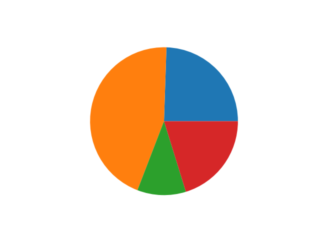
Matplotlib Simple Pie
import matplotlib.pyplot as plt

wedge_sizes = [ 23, 42, 10, 19 ]

plt.pie(wedge_sizes)

plt.show()
#plt.savefig('simple_pie.png')
The number in the array represent the ratio of the areas. They do NOT have to add up to a 100.
documentation of matplotlib.pyplot.pie
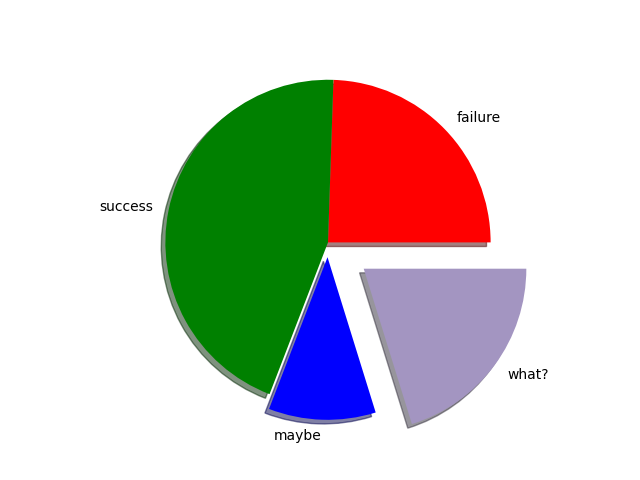
Matplotlib Simple Pie with params
import matplotlib.pyplot as plt

plt.pie(
    x = [ 23, 42, 10, 19 ],
    explode = [0, 0, 0.1, 0.3],
    labels = ["failure", "success", "maybe", "what?"],
    colors = ["red",  "green",  "blue", "#A395C1"],
    shadow = True,
    radius = 1.1,
)

#plt.show()
plt.savefig('simple_pie_params.png')
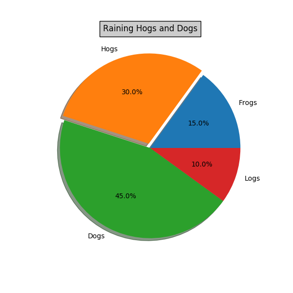
Matplotlib Pie
import matplotlib.pyplot as plt


# Make a square figure and axes
plt.figure(1, figsize=(6, 6))
#ax = plt.axes([0.1, 0.1, 0.8, 0.8])

labels = 'Frogs', 'Hogs', 'Dogs', 'Logs'
fracs = [15, 30, 45, 10]

explode = (0, 0.05, 0, 0)
plt.pie(fracs,
    explode=explode,
    labels=labels,
    autopct='%1.1f%%',
    shadow=True)
plt.title('Raining Hogs and Dogs',
    bbox={'facecolor': '0.8', 'pad': 5})

plt.show()
#plt.savefig('pie.png')
#plt.savefig('pie.pdf')
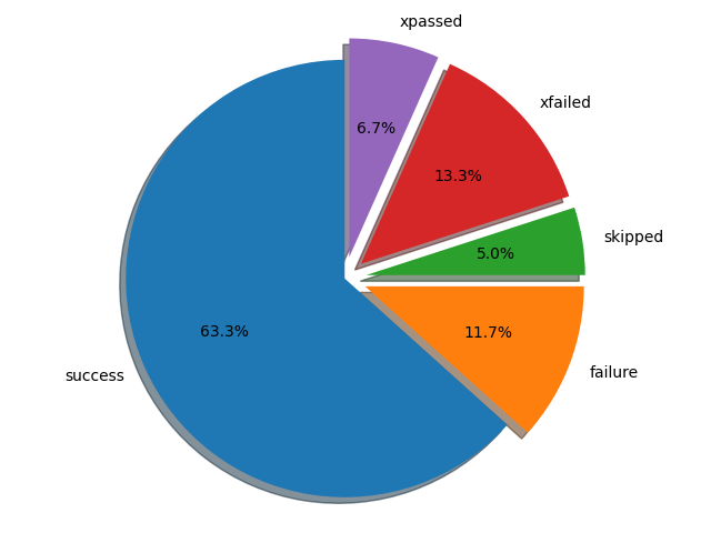
Matplotlib Pie (test cases)
import matplotlib.pyplot as plt

cases = {
    'success': 38,
    'failure': 7,
    'skipped': 3,
    'xfailed': 8,
    'xpassed': 4,
}

explode = (0, 0.1, 0.1, 0.1, 0.1)
labels = cases.keys()
sizes = cases.values()

fig1, ax1 = plt.subplots()
ax1.pie(sizes, explode=explode, labels=labels, autopct='%1.1f%%', shadow=True, startangle=90)
ax1.axis('equal')

plt.tight_layout()
#plt.show()
plt.savefig('pie_for_tests.png')
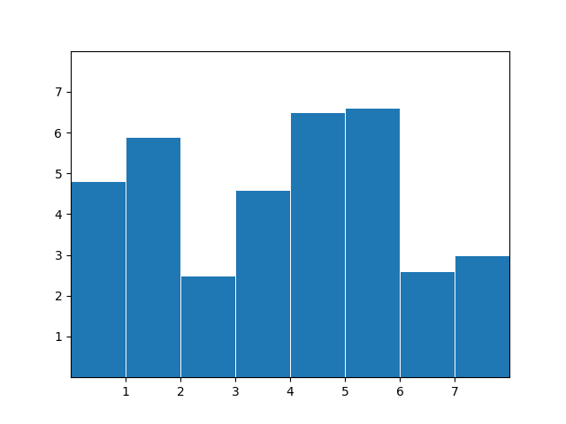
Bar
import matplotlib.pyplot as plt

x = [0.5, 1.5, 2.5, 3.5, 4.5, 5.5, 6.5, 7.5]
y = [4.8, 5.9, 2.5, 4.6, 6.5, 6.6, 2.6, 3.0]

fig, ax = plt.subplots()

ax.bar(x, y, width=1, edgecolor="white", linewidth=0.7)
ax.set(xlim=(0, 8), xticks=range(1, 8),
       ylim=(0, 8), yticks=range(1, 8))

#plt.show()
plt.savefig('bars.png')
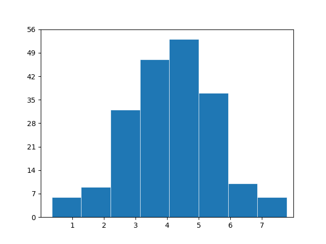
Histogram
- histogram (to group the values into bins)
import matplotlib.pyplot as plt
import numpy as np

np.random.seed(1)
x = 4 + np.random.normal(0, 1.5, 200)

# plot:
fig, ax = plt.subplots()

ax.hist(x, bins=8, linewidth=0.5, edgecolor="white")

ax.set(xlim=(0, 8), xticks=range(1, 8),
       ylim=(0, 56), yticks=np.linspace(0, 56, 9))

#plt.show()
plt.savefig('histogram.png')
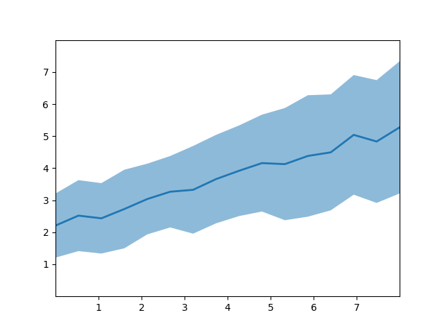
Fill between
import matplotlib.pyplot as plt
import numpy as np

# make data
np.random.seed(1)
x = np.linspace(0, 8, 16)
y1 = 3 + 4*x/8 + np.random.uniform(0.0, 0.5, len(x))
y2 = 1 + 2*x/8 + np.random.uniform(0.0, 0.5, len(x))

# plot
fig, ax = plt.subplots()

ax.fill_between(x, y1, y2, alpha=.5, linewidth=0)
ax.plot(x, (y1 + y2)/2, linewidth=2)

ax.set(xlim=(0, 8), xticks=np.arange(1, 8),
       ylim=(0, 8), yticks=np.arange(1, 8))

#plt.show()
plt.savefig('fill_between.png')
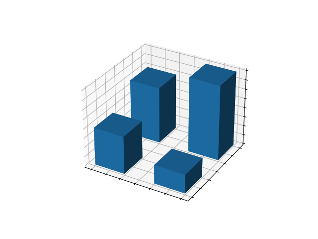
3D bars
import matplotlib.pyplot as plt
import numpy as np

x = [1, 1, 2, 2]
y = [1, 2, 1, 2]
z = [0, 0, 0, 0]
dx = np.ones_like(x)*0.5
dy = np.ones_like(x)*0.5
dz = [2, 3, 1, 4]

# Plot
fig, ax = plt.subplots(subplot_kw={"projection": "3d"})
ax.bar3d(x, y, z, dx, dy, dz)

ax.set(xticklabels=[],
       yticklabels=[],
       zticklabels=[])

#plt.show()
plt.savefig('3dbars.png')
Scatter, histogram
- scatter - just the values
- plt.hist(data, bin=10)
Other
# /// script
# requires-python = ">=3.13"
# dependencies = [
#     "matplotlib",
# ]
# ///

import matplotlib.pyplot as plt
import numpy as np

#plt.style.use('_mpl-gallery')

# make data
x = np.linspace(0, 10, 100)
print(x)
#y = 4 + 1 * np.sin(2 * x)
#x2 = np.linspace(0, 10, 25)
#y2 = 4 + 1 * np.sin(2 * x2)
#
## plot
#fig, ax = plt.subplots()
#
#ax.plot(x2, y2 + 2.5, 'x', markeredgewidth=2)
#ax.plot(x, y, linewidth=2.0)
#ax.plot(x2, y2 - 2.5, 'o-', linewidth=2)
#
#ax.set(xlim=(0, 8), xticks=np.arange(1, 8),
#       ylim=(0, 8), yticks=np.arange(1, 8))
#
#plt.show()
# /// script
# requires-python = ">=3.13"
# dependencies = [
#     "matplotlib",
# ]
# ///

import matplotlib.pyplot as plt

x = [v / 100 for v in  range(200)]
y_linear = x
y_square = [v*v for v in x]
y_cube   = [v**3 for v in x]

#print(y_cube)


plt.figure(figsize=(5, 2.7), layout='constrained')
plt.plot(x, y_linear, label='linear')
plt.plot(x, y_square, label='quadratic')
plt.plot(x, y_cube, label='cubic')

plt.xlabel('x label')
plt.ylabel('y label')
plt.title("Plot numbers")
plt.legend()
plt.show()
# /// script
# requires-python = ">=3.13"
# dependencies = [
#     "matplotlib",
#     "numpy",
# ]
# ///

import matplotlib.pyplot as plt
import numpy as np

x = np.linspace(0, 2, 100)


plt.figure(figsize=(5, 2.7), layout='constrained')
plt.plot(x, x, label='linear')
plt.plot(x, x**2, label='quadratic')
plt.plot(x, x**3, label='cubic')

plt.xlabel('x label')
plt.ylabel('y label')
plt.title("Plot numbers")
plt.legend()
plt.show()
import matplotlib.pyplot as plt

plt.plot([1, 2, 3, 4], [1, 4, 9, 16], 'ro')

# setting the size of the graph
#plt.axis((0, 6, 0, 20))  #  [xmin, xmax, ymin, ymax]
plt.show()